FINAL VIDEO

This is the exported version of my final video that I have uploaded to YouTube as a better viewing platform. 

Although I am happy with the outcome, as I had no prior experience with the software or film editing of any kind (as I chose the print work brief for my Foundation Portfolio) I feel that there are many areas where my video can be improved:

  • When watching my video I am really disappointed with how I have synced the mouth movements of my main character to the lyrics of the song, as they are slightly out of time on numerous occasions. I do feel that this is due to my main character not pronouncing the words of the song well enough, making his mouth movements too subtle. As the director I should have noticed this whilst filming and should have attempted to address the problem and eradicate it.
  • I am also not really happy with the first half of the video compared to the second, as I feel I did a much better job of telling the story in the second half compared to the first. In general the second half flows better and appears more like a music video rather than a random compilation of clips.

FINISHING THE VIDEO

Once I was happy with my video and was confident that I had done everything that I could do, the next step was to render and export it. After rendering the video, I accessed 'File > Export > Media' and opened the window that came with this, adjusting the settings and exporting the video, as shown below.
The following screen shots show my finished sequence in Premiere Pro. Having started this process having no previous knowledge of the software at all, I am really proud of the video that I have produced. Of course I found it hard and did realize when I came to edit that my storyline perhaps wasn't the best to portray in a music video, however I did the best with what I had and I feel that my attempt was successful.


IMPROVEMENTS TO MY MAGAZINE AD

Having re-evaluated my magazine advertisement, I decided that I wasn't happy with it, as I felt that it was perhaps rushed and I hadn't put as much effort into it as I had done with the CD cover, therefore when they were put together, the magazine advert let down the CD cover. The image below details what I wasn't happy with and what I aimed to change (click to enlarge).


After creating a list of what I wanted to change, I started to make changes, starting with adding an image of my artist, Jonny. In order to keep correlation between each text, I knew that I wanted to use an image in which he was wearing the same costume as he is in the video. Instead of organising another day where I could take further images in my location, I decided that the most practical way to gain an image was to take a still from my video whilst in the process of being edited. There were a number of expectations that this still had to meet, as detailed below:
  • to showcase the artist; showing his face/preferably full body as I feel that an still taken from a long shot for example would prove to be easier to fit into the piece, as there wouldn't be any straight edges that would occur if the still was taken from a medium shot or close up.
  • to keep correlation between the texts by showing his costume, which reflects the weather which in turn reflects the mood of the video.
  • shows the location which is represented in the lyrics and has links to my storyline; hosting a private event in a public place, contrasting the events and heightening the impact of the words without any background interference.
The image below is the still that I decided on, as I feel it meets all of the criteria that I presented, and has a lot of potential as an image, as I can use the magnetic lasso tool on Photoshop to cut around the image and make use of the interesting shapes that it provides, in an attempt to tie this in with the 'flow' of the layout on the magazine advertisement. 


As you can see, I made a lot of changes, the main being that I added the image of my artist. Using the 'Magnetic Lasso Tool' in Photoshop, I cut out the image of Jonny stood against the tree and placed it at the right side of the page. I rubbed out the top of the image to line it up with the ripped wallpaper at the top, as I couldn't just place it behind because the wallpaper image is set to a lower transparency. I'm pleased with how this turned out, and I definitely feel that an image of the artist is what the advertisement was lacking, as it gives it a new dimension and adds to the formation of the artist's identity.


I added the following items to the advertisement, in order to involve more conventions of a magazine advertisement for a CD, including more ripped wallpaper at the bottom to balance out the layout and three reviews, one involving words and the other two involving a 'star' rating, like the example shown below from Kasabian's advertisement for their album 'Empire'.


Whilst in the process of attempting to improve my magazine advertisement, I kept in contact with my Media lecturer, sending updated versions of the document over as often as possible in order to gain some feedback on how I was doing. After making the bulk of my changes, my lecturer provided me with the following comment:

"Really like ad. Do me a favour, keep that saved, and try instead of having 'the new album' try having his name, maybe a touch smaller, and try having him on left instead of on right. I know they're just picky things but there's just something I think needs changing and I can't put my finger on it!"

Because my lecturer was having a hard time deciding what it was she thought my piece was lacking, she forwarded the JPEG of my magazine advertisement to a friend who is a Graphic Designer, who provided me with the following feedback, which I found particularly helpful as I knew that it was coming from an especially professional point of view:

"Design, it's pretty impressive. I think it's mainly a case of being a bit more practical. At the moment the main headline screams 'new album' but I don't know who it's by - the artist name and 'new album' should be more equally weighted. So maybe have "THE NEW ALBUM BY JONATHAN GRAY" or something as the main headline, and make the 'stellar' review a bit easier to read too - it's very quiet. I think the shot of the chap and the tree is ok but the cut-out at the bottom is a bit clunky - maybe make the photo bleed off the bottom of the page so the bottom of the tree isn't visible - the text along the bottom can stay where it is but can be overlaid on top of a strip of white/semi transparent colour so that it's still readable over the pic behind it..."

I agreed with the feedback that I received from both my lecturer and her friend, as I had previously mentioned I didn't think that there was enough attention brought to the name of the artist, or even the name of the album, as the main sell line was 'THE NEW ALBUM', which doesn't say anything about the artist, and could be applied to anyone.

"Yeah I like it better with the artist name, I know I'm a pain but if you have access to Photoshop, try it not in italics... Yeah I like it with the image of the artist but I think you could have a strong piece still if you had decided to go without it - if the rest was centred - now that the text is different below the CD image."

I was really pleased with the feedback that I received, however I didn't agree with the second piece, as I liked having the title in italics and definitely wanted to keep the image of my artist, as I feel that this makes the image of my artist stronger and brings the three texts together as a whole advertising campaign.

THE FINISHED PIECE
I'm really pleased that I reevaluated my magazine advertisement and decided to make changes, as I feel I have improved what was a strong piece of work to an even more successful piece, that I believe fulfils conventions of a stereotypical magazine advertisement, and alongside the CD cover and video (when it's finished) provides the artist with a strong image that aims to appeal to the target audience.

EDITING THE FOOTAGE

Once I had filmed all of my footage and was happy with both the quality and the quantity, I began to sort out the clips, identifying which were successful and where they would be used, e.g. chorus, verse, opening, ending. This made the overall process much easier to begin, as I knew exactly where I wanted to include the clips, removing any time where I would be playing around with certain clips to ascertain where they could go.


I then created a Premiere Pro file, as shown on the left, and saved this into the same folder as all of the clips in order to avoid corrupting the file if I was to move any of the clips to another location.


To make a start I imported all of my clips into Premiere Pro using the window shown above, putting them all to the side in the project file, shown in the other print screen I have provided. The next step was to import the song, Charlie Simpson's 'Please Let Me Go', which I simply dragged from the project file and onto the sequence, cutting out some of the blank noise at the end of the track which I deemed unnecessary:


I then started to compose my video, dragging and dropping the clips onto the sequence. The first ones that I put into place were the shots of Jonny singing, as I knew where these needed to go as they featured lyrics which I simply matched to the song. I found that when I was importing the clips a lot of them still had audio, therefore I simply muted this part of the sequence to remove the sound to prevent it from interfering with the editing process.

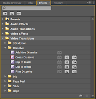
Because I was still finding my way around the software, I started to experiment with transitions, finding which ones I liked and felt that suited my video and genre. To do this, I accessed the 'Effects' bar in the bottom left hand corner of the screen and opened the file 'Video Transitions' to try out the different transitions. I found that many of them definitely weren't was I was looking for, as they were too 3D and just didn't suit the subtle look that I was going for. However the transitions under 'Dissolve' provided the subtle cross over between tracks that I wanted to achieve. To use this transition I simply had to drag and drop it between the two clips that I wanted to blend, ensuring that as one image was fading away, the other image would be fading on, appearing to 'dissolve' the clips together, as shown below:


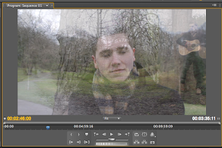
Another transition that I used from that file was 'Dip to Black', which I used at the beginning and end of my video sequence. I felt that it was a clean and professional way to begin the video, and for the ending where Jonny is walking away, I found that it put greater emphasis on the emotion of the clip, as it helped to symbolise the end of the relationship.


HOW MY STORYBOARD HELPED THE FILMING PROCESS


When on location with Jonny, I had the image of my storyboard saved to my smart phone, which I referred to in order to replicate the shots that I had planned to film. This really helped the process, as it eliminated any time wasting by ensuring I could direct straight to the specific areas that I had identified during the recce to the park and film the shots that I felt that area could provide. As my video doesn't follow a specific storyline, I felt that once I had filmed these shots, I had free reign to film whatever I felt looked good on the day, knowing that I had some pre-planned solid footage to use to tell the story with.