I feel that my media product, which consists of a music video with an accompanying CD cover and magazine advertisement, has made considerable use of forms and conventions of existing media products, a lot of which I have actually used as inspirational texts when in the production process. Below I will evaluate the various conventions that I feel I have utilised in my work, operating from various different genres and media platforms.

The main narrative of my music video involves a young couple breaking up. This is a very common topic for popular music, with one of the most famous examples being 'Someone Like You' by Adele. This video (shown to the right) is a very minimalistic video and concentrates only on the main character, without any interference from outside influences.
By including just one character, the camera is able to concentrate solely on them, using shots like close ups to show the facial expression of the character, emphasizing the emotional turmoil that they are experiencing from their break-up. This is the effect that I wanted to create with my music video, which I feel I have successfully achieved. My main character Jonny is the main feature of the video, with only a few shots involving the 'girlfriend' character played by myself. The majority of the music video consists of a mixture of close ups, medium shots and long shots of Jonny miming the lyrics to the song with a sombre facial expression.

Another shot that I have included that I feel follows another convention of a break-up storyline is the 'walking away' shot, which is a stereotypical shot from a video of this genre, as it symbolizes the man/woman walking away from their partner and the relationship that they once shared. As I had proposed in my early planning stages, I wanted to include this shot at the end, as I feel it has more impact this way. Adele's video for 'Someone Like You' actually follows her on a walk, which I feel has been done as it is a typical thing for someone to do when they have a lot on their mind, or need to 'escape'.


However, I feel that I have also challenged the typical representation of the couple in a break-up themed music video. In Adele's video, she is the person that has been 'dumped', with the song describing her feelings on the matter, contrary to my music video in which Jonny is the 'dumpee', explaining how he can't be with his partner anymore and needs her to 'let him go'. In this sense, I feel that I have both incorporated AND challenged these particular conventions of a music video that revolves around a break-up narrative.
 In terms of media theory, and the conventions of music videos that are recognised by various theorists, I feel that my music video follows a number of Anthony Goodwin's theories of language use and structure in a music video. The first is 'Links between lyrics and visuals',which I feel I have embodied by having Jonny mouth the words to the song for some shots. The more emotional lines such as:
benefit from being shown coming from the character as I feel this heightens the emotion of these words and makes them more believable, evoking an emotional reaction from the viewer. Furthermore, a lyric at the beginning of the song refers to holding hands, therefore as planned, I have filmed my two characters holding hands at this point, then gradually separating hands further into the video which symbolises their break up.
Another of Goodwin's theories of language use and structure in a music video that I feel relates to my video is the similar 'Links between music and visuals'. The way in which this links to my video is the fact that I have involved an instrument in my video. Because my main character Jonny actually plays guitar in a band, I was able to film him playing the strong guitar melody that features heavily in the song, in order to occupy the time rather than just the couple on screen throughout. This links the music to the visuals, a conventional tool used in many music videos, especially those from my chosen genre, Alternative/Indie.


Typical Structures;
My video concept, in my opinion, loosely follows a 'Fragmented' structure. Although it does have a narrative, it doesn't follow a solid 'fairy tale' structure whereby the couple break up, get back together and live happily ever after, etc. My narrative is literally that they're in the process of breaking up, but don't follow a string of events that decides their fate. I feel that this confusion/enigma is fitting for my chosen genre of Alternative/Indie, as videos from this genre rarely follow an obvious narrative like videos from Pop artists might.

 When conducting research for my Extended Project, I came across this article in the September 2012 issue of Media Magazine, titled 'The Iconography of the Album Cover'. I read the article and found that it addressed many of the aspects of creating a CD cover, and featured an interview from Julian House, a creative partner at a London creative agency 'The Intro Partnership'. He works on the creation of CD covers for various artists, and when asked how prominent genre conventions were in the production process, he commented:


 Furthermore, I feel that the wallpaper reflects the narrative of my video. This is because it revolves around a break-up; a domestic event that occurs in the private sphere of society, away from the public eye. Obviously, wallpaper is something that is associated with a home, probably a more up-kept home that could connote a happy family. Therefore the fact that the wallpaper is has a considerably 'drab' colour scheme and is actually ripped represents the broken relationship and therefore the broken domestic structure of the couple.


In order to explain how I feel I met the conventions of a magazine advertisement, I have created a Prezi which can be accessed below:
Magazine Advertisement Conventions
"I don't want you, and I don't need you anymore"
Another of Goodwin's theories of language use and structure in a music video that I feel relates to my video is the similar 'Links between music and visuals'. The way in which this links to my video is the fact that I have involved an instrument in my video. Because my main character Jonny actually plays guitar in a band, I was able to film him playing the strong guitar melody that features heavily in the song, in order to occupy the time rather than just the couple on screen throughout. This links the music to the visuals, a conventional tool used in many music videos, especially those from my chosen genre, Alternative/Indie.

This can be seen in Birdy's music video for 'Shelter', in which she plays piano. This links the music with the visuals, and also provides an example of how I have followed a convention of a video from my genre.

My video concept, in my opinion, loosely follows a 'Fragmented' structure. Although it does have a narrative, it doesn't follow a solid 'fairy tale' structure whereby the couple break up, get back together and live happily ever after, etc. My narrative is literally that they're in the process of breaking up, but don't follow a string of events that decides their fate. I feel that this confusion/enigma is fitting for my chosen genre of Alternative/Indie, as videos from this genre rarely follow an obvious narrative like videos from Pop artists might.

 When conducting research for my Extended Project, I came across this article in the September 2012 issue of Media Magazine, titled 'The Iconography of the Album Cover'. I read the article and found that it addressed many of the aspects of creating a CD cover, and featured an interview from Julian House, a creative partner at a London creative agency 'The Intro Partnership'. He works on the creation of CD covers for various artists, and when asked how prominent genre conventions were in the production process, he commented:
"I tend not to think of designs in terms of genre; each specific job exists in its own world with its own set of reference points."
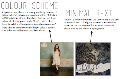
Perhaps this is how he approaches his work, however I feel that following genre conventions is key in attracting the proposed target audience. Because my song belongs to the Alternative/Indie genre, I knew that I had to create a CD cover (and magazine ad) that has certain similarities with others from this genre, as making a cover that doesn't represent that genre would not appeal to followers of that genre. One example which I have used as an inspirational text is Birdy's cover for her self titled album 'Birdy':

On one hand, I do feel that I have followed certain conventions of texts from my intended genre, however there is one thing that I chose to do that I feel challenges one of the most obvious conventions of the CD cover in genera; my choice to not include an image of my artist on the cover. Typically, because a CD cover is used as an advertising tool, its aim is to bring as much attention to the artist as possible. This usually involves including an image of the artist on the cover, to bring awareness to what they look like and to sell their face as a brand in its own right. Using iTunes, I accessed the top albums from the R&B music genre, one that could be considered opposite to my chosen genre. The image below illustrates that a convention of an album from this genre is to make the artist the focus:

However, the second image below shows the top albums for the Alternative genre, which clearly shows that many artists from this genre do not include an image of themselves, as it simply isn't what they are 'about'. In my opinion, the genre is better suited to not including an image of the artist, as they are more focused on their music, rather than their image. We cannot homogenize this genre, as examples from Lana Del Rey and Paramore show successful albums that do include their image, however I still feel that these two examples do have a stronger image than that of Foals or Alt-J, and therefore use this as an advertising tool to increase their artist awareness. Typically female artists who are attractive are used on album covers as they are seen as a sex symbol as well as a talented artist for many men, which further increases their sales.

The majority of these album covers involve an Instagram-esque image that features muted colours and an unusual focal point, such as legs coming through a ceiling purple/pink bandstand. With the rise of the popular photo-sharing social networking app 'Instagram', I feel that this is the vintage feel that many young people are aiming to achieve when posting unusual photos. I feel that my final CD cover fits in with this look, as it follows a muted colour scheme and focuses on a wallpaper pattern that I have previously identified to be prominent in popular culture.
 Furthermore, I feel that the wallpaper reflects the narrative of my video. This is because it revolves around a break-up; a domestic event that occurs in the private sphere of society, away from the public eye. Obviously, wallpaper is something that is associated with a home, probably a more up-kept home that could connote a happy family. Therefore the fact that the wallpaper is has a considerably 'drab' colour scheme and is actually ripped represents the broken relationship and therefore the broken domestic structure of the couple.
Record Label;

Another way in which I have followed the conventions of the media texts that I have created is by my use of a record label and other information that make up the formalities of a CD cover/magazine advertisement. These details are typically located at the bottom of the back cover of the CD sleeve, whereby you typically find a record label, a copyright statement and various websites for both the artist and the record label. As you are prohibited from using existing images from Google, I knew that I had to design my own record label that looks professional whilst still fitting in with the overall layout of the cover. Taking inspiration from Island Records, one of the most renowned record labels with a very recognizable logo that is familiar worldwide, I was able to create an image using Photoshop that I feel could easily pass as a professional business logo. I feel that the Island Records logo with its famous palm tree silhouette is very simple, which is what I feel makes it memorable, therefore I took inspiration from this to create my own silhouette-inspired logo. When it came to placing this onto both the CD cover and the advertisement, I decided to alter the colour to create a dark indigo shade that matched the text on both pieces. The 'gh' was transparent allowing the cream background to come through, tying it into the layout and allowing it to be seen but not be overpowering.
This logo, along with a barcode and a copyright statement fill the lower part of the back CD cover below the ripped piece of wallpaper. They give the piece more authenticity and present it as a professional document that contributes to the overall image of the artist.


In order to explain how I feel I met the conventions of a magazine advertisement, I have created a Prezi which can be accessed below:
Magazine Advertisement Conventions
No comments:
Post a Comment