CD COVER - TEST PIECE

To make a start playing around with images and effects, I found this wallpaper online, and was drawn to it because of its colour pallet. The blue/green/grey colour is exactly what I wanted to incorporate into my work, as you can see by my earlier mood board. These colours are also the colours that I am aiming to capture in my moving image in my chosen setting of a forest. Furthermore, I noticed that this wallpaper was worn and dirtied, and looked like it had been exposed to sunlight for too long, which is something that appealed to me, so I decided to use it as a test piece in preparation for my final piece. The raw image was too bright, so I altered the exposure in order to make it much darker, allowing me to use an off-white font.

I got my fonts from www.dafont.com and decided that I wanted a thin font that looked similar to handwriting. The full title of the song is 'Please Let Me Go' however I felt that this was too long and didn't give me a lot of scope for layout. Because of this, I decided to shorten the title, making it a much smaller and much more aesthetically pleasing three worded title with equally weighted words; 'LET ME GO'.

As soon as I put this font onto my wallpaper I knew that it was way too thin and couldn't be seen against such a busy background image. This lead me to find the font to the right- a similar but much thicker font that stood out against the background and was clearly legible. At first I thought that I wanted to place the font towards the bottom of the image. I had it smaller and in the right hand corner, however I decided that the weight of the font called for it to be larger, so I made it the width of the image. The image doesn't have a focal point, so I have made the title the focal point, putting it in the very center and making it the aspect that the viewer would notice at first glance.
To try out a few different versions, I increased the brightness of the background as I felt that I wanted less of a contrast between that and the title. I was pleased with how this turned out, and felt that the title was much more visible and strangely stood out more than it did against the darker background. Alternatively, I also made a grey-scale version of the image which I also quite liked, however this has proved to me that I want to use colour, as the black and white version doesn't link as well to my vintage vibe or colour pallet of my location.

INSPIRATIONAL TEXTS - CD covers

These are all examples of CDs that I own and feel have certain similarities to the look that I am aiming for. I really want to go for quite a worn down theme, and these covers provide that for me to take inspiration from.

Stairway to Heaven - Led Zeppelin
This is actually a perfect example of how I want my album cover to look. The vintage vibe that I have previously mentioned is shown perfectly here, with the frame and the worn down/ripped off wallpaper. Frame and wallpapers are definitely things that I want to incorporate into this cover as I mentioned in my initial ideas post, and I feel that creating something along the lines of this cover would meet my expectations completely. Something that I really like about this cover is the ripped effect, where the wallpaper rips away to reveal a housing estate. This gives the album cover a very gritty feel, and also follows my concept of the 'broken home' where my couple are breaking up.

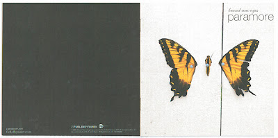
Brand New Eyes - Paramore
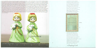
This is the cover of Paramore's third album, however it isn't the main cover that has most inspired me, but the inside pages of the booklet. The front cover obviously holds the cover image, and within that there are several pages that include the lyrics for each song on the album. Many albums include this lyric booklet, however it was the images behind this that I was most drawn to.
Each page within the booklet features a random image that looks worn and has the typical vintage vibe that I'm going for. These two pages show legs behind a curtain and a locket hanging against what we can assumed to be wooden panels  The simplicity of these images is what drew me to them in the first place. From what I as a fan can grasp, these images may link to the lyrics on top of them in some way, however this isn't obvious is the slightest, with the true meaning behind them only being known by the band. This mystery and allusiveness is what I want to try and embody in my work, leaving the audience curious and eager to buy the album and listen to/look at its contents.

A frame has been used on another page, which also stood out to me as I have been considering using frames in my own work. The frame is ornate and when placed on a white background, draws the viewers attention to it which in turn draws their attention to the lyrics which have been aligned to stay marginalized with the frame.


Although the pages are all different, it is obvious that they all follow a them, which in my opinion is worn and vintage; appealing to the trends of the time and giving their target audience what they want, along with the music. The page for the song 'Misguided Ghosts' is particularly appealing to me as it shows a road into a forest, which is my chosen location. One of my proposed shots (see storyboard post) was that of a path in a forest, where my characters would walk down holding hands, then cutting to a shot of just one character walking to clearly show their break up. This has inspired me to definitely use this shot, and to even take a still image of that particular location and use it as part of my advertisement documents.
Employement - Kaiser Chiefs
I really liked this CD cover beacuse it has the 'worn' look that I want to go for. I believe that this cover is depicting an old box, as the sides of it resemble the work edges of a box lid and the sticker on the front involves the words "A box of tricks". This cover shows me how I can successfully achieve the worn/tattered look that I am aiming for, without making it look too deliberate. If I was to make this too deliberate, or too neat, I would lose the authenticity that I want my cover to have, making it a comical attempt at a vintage style.

BIRDY CD COVERS

Because Birdy's video concepts have been of huge inspiration to me, I decided to have a look at her CD cover designs in order to help me to create mine. I really liked the way in which Birdy films her videos, and I feel that they link closely with my concept, therefore knowing that an artist should keep their material consistent, I knew that this should be of inspiration to me.

The first image is the cover of Birdy's self-titled debut album which features the tracks that I have taken inspiration from for my video. The second image is the deluxe edition of this album, and the differences between the two are minute. Many artists do this, and simply make small changes such as colour in order to create a different cover that customers will still recognise as coming from the artist. In order to differentiate these covers, Birdy has taken off her jumper, and when closely analysing these two images you can also notice the change in lighting. In the top image the lighting is focused in on Birdy's face, which I feel doesn't look appealing and makes Birdy look drained and very young. However, the lighting has been altered in the second image to give a much more flattering tone. Birdy is also wearing make-up on the second cover, which could be symbolic of her growing up, or could be an attempt to move away from the young age that everyone associates her with.

Personally I prefer the second image as I feel that she looks much more attractive, which may not be the main thing that she aims to achieve, but could widen her audience. The angle has been adjusted to more of a straight-on medium shot which aids the angle at which the light hits her face. Furthermore, the costume in this cover is much more subtle, as I felt that the red jumper not only disrupts the natural colour pallet, but it also puts emphasis her young age and could have limited the sales of her album. This could be the cause of the change for the deluxe edition.

As mentioned in previous plans, I wanted to have the characters of my video in very natural coloured clothes, and wearing minimal amounts of make-up, and I feel that Birdy has achieved this and in my opinion it is really effective. Covers from artists such as Beyonce, Cheryl Cole, Rita Ora and Rihanna are always very over the top and glamorous, which suits their genre of music, and that is what I feel Birdy has achieved; a cover that suits her genre of music and personal style.

Adding to all of this is the fact that the background of Birdy's cover is worn wallpaper/walls which appears to be in a run down house. Seeing that a young artist like Birdy has been able to pull this off is reassuring for me, as not many current artists have gone for a similar theme to me. This is proof that my selling point of 'vintage' will be successful.

INITIAL IDEAS

I feel that my video concept and song has quite an indie vibe, and something that is popular in the indie scene is vintage. This has become very contemporary in the past few years, with people shopping in vintage shops, companies taking advantage and having their products covered in a vintage print etc. Because of this, I want to roll with this theme and base my print documents around it. Vintage floral wallpaper patterns are appearing a lot on products such as bedding, cushions, actual wallpaper, note pads and other household items and are a popular choice for young adults which are the target audience for my product. These products can be seen on websites such as Urban Outfitters which is a shop that my target audience would typically buy their clothes from, so it's reassuring that a website like this sells products that incorporate my theme;
Another product that is also sold on this website that I am a huge fan of is frames. I have many frames in my house and my bedroom and love having pictures of my friends and family out where I can see them and not just in a photo album. I've used frames in past creative pieces and know that they work well and can give a vintage feel. 
Obviously, frames can be hung on a wall, which has given me the inspiration to use vintage wallpaper as the main background for my album cover.

Together, frames and wallpaper can provide me with the vintage feel that I want to achieve, and can also appeal to my target audience by incorporating patterns and items that they're buying from retail stores. The image below is a collage I have created that incorporate the two items, and highlight the basic theme that my CD cover, and also my magazine advertisement will follow.

The frames and the wallpaper are items that you would typically find in a house, particularly a happy home where the owners take pride in decorating and enjoy having loads of photos around their house. This also suggests a married couple, who are happily married, which is the exact opposite of my video concept. The couple featured in my chosen song and video are in the process of a break-up, therefore the wallpaper, preferably damaged and worn, represents a broken family or a broken relationship. So as for the frame, I will either have no picture in it, or a negative picture that represents the break-up.

STARTING MY PRINT WORK

Instead of getting carried away by over planning my video, I have decided to move onto creating my two print pieces. As I've mentioned, out of the three provided options I have chosen to create the CD cover and the magazine advertisement as I feel that these two could prove to be the most relevant to my proposal and are also two areas in which I believe I have the skills to create professional documents that will fulfill their purpose. 

Initially the reasoning behind choosing the CD cover was that the location that I plan to use would have provided many photo opportunities which could have be used for the album cover. I thought that these would have given the artist a distinct image and a consistent advertisement theme/concept, however I've realized that this isn't realistic. After seeking inspiration from previous A2 portfolios, I recognized that the CD covers that used a still from the moving image were not as successful as the covers that used a separate image from the location or a different image all together. Furthermore, as forthcoming posts will show, the CD covers that I own don't use a still from the artists videos, however they are still recognizable as being from that artist.

The second option of the magazine advertisement links very closely to the CD cover, as a small image of the cover will have to appear on the advertisement so that the audience know what is being advertised. Because of this, the two have to be compatible with each other and must have things in common to reinforce the artist's image. Things like colours, fonts, images and even the overall mood must be consistent to provide a tight, crisp advertising campaign that will essentially sell copies of my album.