This is actually a perfect example of how I want my album cover to look. The vintage vibe that I have previously mentioned is shown perfectly here, with the frame and the worn down/ripped off wallpaper. Frame and wallpapers are definitely things that I want to incorporate into this cover as I mentioned in my initial ideas post, and I feel that creating something along the lines of this cover would meet my expectations completely. Something that I really like about this cover is the ripped effect, where the wallpaper rips away to reveal a housing estate. This gives the album cover a very gritty feel, and also follows my concept of the 'broken home' where my couple are breaking up.
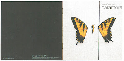
Brand New Eyes - Paramore
This is the cover of Paramore's third album, however it isn't the main cover that has most inspired me, but the inside pages of the booklet. The front cover obviously holds the cover image, and within that there are several pages that include the lyrics for each song on the album. Many albums include this lyric booklet, however it was the images behind this that I was most drawn to.
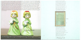
Each page within the booklet features a random image that looks worn and has the typical vintage vibe that I'm going for. These two pages show legs behind a curtain and a locket hanging against what we can assumed to be wooden panels The simplicity of these images is what drew me to them in the first place. From what I as a fan can grasp, these images may link to the lyrics on top of them in some way, however this isn't obvious is the slightest, with the true meaning behind them only being known by the band. This mystery and allusiveness is what I want to try and embody in my work, leaving the audience curious and eager to buy the album and listen to/look at its contents.
 A frame has been used on another page, which also stood out to me as I have been considering using frames in my own work. The frame is ornate and when placed on a white background, draws the viewers attention to it which in turn draws their attention to the lyrics which have been aligned to stay marginalized with the frame.
Although the pages are all different, it is obvious that they all follow a them, which in my opinion is worn and vintage; appealing to the trends of the time and giving their target audience what they want, along with the music. The page for the song 'Misguided Ghosts' is particularly appealing to me as it shows a road into a forest, which is my chosen location. One of my proposed shots (see storyboard post) was that of a path in a forest, where my characters would walk down holding hands, then cutting to a shot of just one character walking to clearly show their break up. This has inspired me to definitely use this shot, and to even take a still image of that particular location and use it as part of my advertisement documents.
Employement - Kaiser Chiefs
I really liked this CD cover beacuse it has the 'worn' look that I want to go for. I believe that this cover is depicting an old box, as the sides of it resemble the work edges of a box lid and the sticker on the front involves the words "A box of tricks". This cover shows me how I can successfully achieve the worn/tattered look that I am aiming for, without making it look too deliberate. If I was to make this too deliberate, or too neat, I would lose the authenticity that I want my cover to have, making it a comical attempt at a vintage style.

I really liked this CD cover beacuse it has the 'worn' look that I want to go for. I believe that this cover is depicting an old box, as the sides of it resemble the work edges of a box lid and the sticker on the front involves the words "A box of tricks". This cover shows me how I can successfully achieve the worn/tattered look that I am aiming for, without making it look too deliberate. If I was to make this too deliberate, or too neat, I would lose the authenticity that I want my cover to have, making it a comical attempt at a vintage style.


No comments:
Post a Comment